Usability Tests and Results
To enhance our platform's user experience, we conducted usability testing, gathering direct feedback from users to ensure the platform is both efficient and enjoyable.
We planned usability testings for the two main actors in our system, students and teachers. So far, we have conducted only usability testing with students and plan on doing it with teachers in the near future.
The feedback from these sessions was crucial for understanding user's needs and to refine our platform. Our aim is to create a more intuitive and satisfying experience for all users, demonstrating our commitment to continuous improvement based on user feedback.
On the prototype (Figma)
On March 21st, we took a Usability test in person with 19 participants, 3 females and 16 males, all Informatics students, from Human-Computer Interaction course, all young adults. We presented 5 differents tasks, which were:
-
Log in and indicate how many master's dissertations are on the website and how many are available.
-
Analyze the dissertation "UI Design principles and their effects in network traffic" and indicate the name of the supervisor, co-supervisor and the courses for which it is intended.
-
Show interest in the "AI-based River Discharge Forecasting" dissertation and indicate which message appeared to confirm your choice.
-
Remove interest in the dissertation "Porcupine: Visualization and Analysis of Multimodal Interaction" and indicate the number of dissertations that are present in the profile and the student's course code.
-
Check the new notification received and sign the agreement already signed by the professor. Indicate the location of the assigned dissertation and the confirmation message.
Results
We registered a 96.8% task completion ratio. Below, it's possible to see all tasks and if the participant completed it or not.
We also registered a 78.9% task success rate, i.e. if the participant reached the right answers.
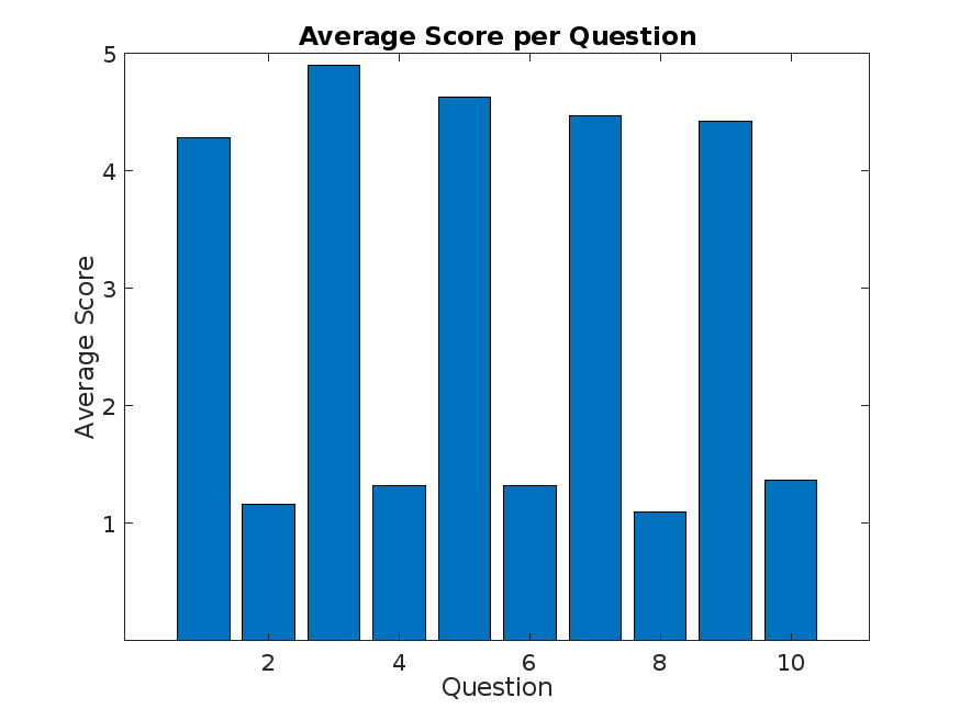
After finishing the tasks, we presented a post-task questionnaire. The following figure that it's shown has this property:
On even numbered questions the best score is 5 and on odd numbered questions the best score is 1.

With this data, it's also possible to calculate the SUS (System Usability Scale) score, which is 91, and because it's greater than 68, this means that the system is considered to be usable.
Suggested Improvements and notes
The comments were mostly that the system, despite being used for the first time, was intuitive and easy to understand.
It was suggested that we should have labels to clarify terms and expressions used.
We also noted that some participants were thinking that when "Escolhida" option appeared, the dissertation was chosed by the own user. Also, that notifications should be more clear with alerts.
Lastly, we registered that Task 2 was completed using an extra step, because all information necessary was displayed on list dissertations, but some participants clicked on "Ver mais" button.